1. Traffic Risk Prediction involved Children Pedestrians in Reading, PA
R; JavaScript; Google Cloud Platform
In the United States, children remains 20% of total 38,680 car crashes records in 2020, which facing a high risk of being involved in traffic accidents. This research project aims to address this issue by focusing on this vulnerable group and developing a precise model to identify potential risks and implement protective measures.
Crash Data Aggre
gated on Census Tract Level and Road Segment Level
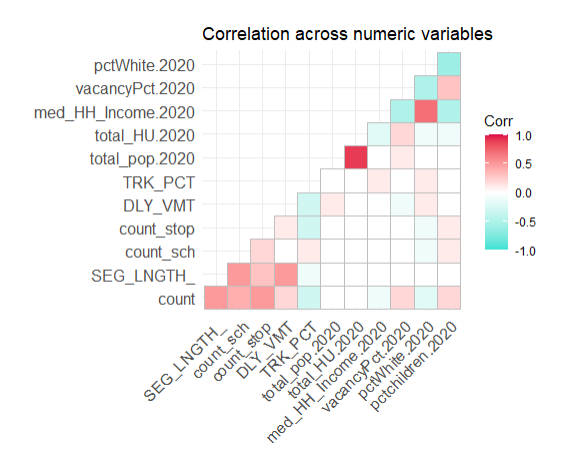
Variables Correlation Matrix
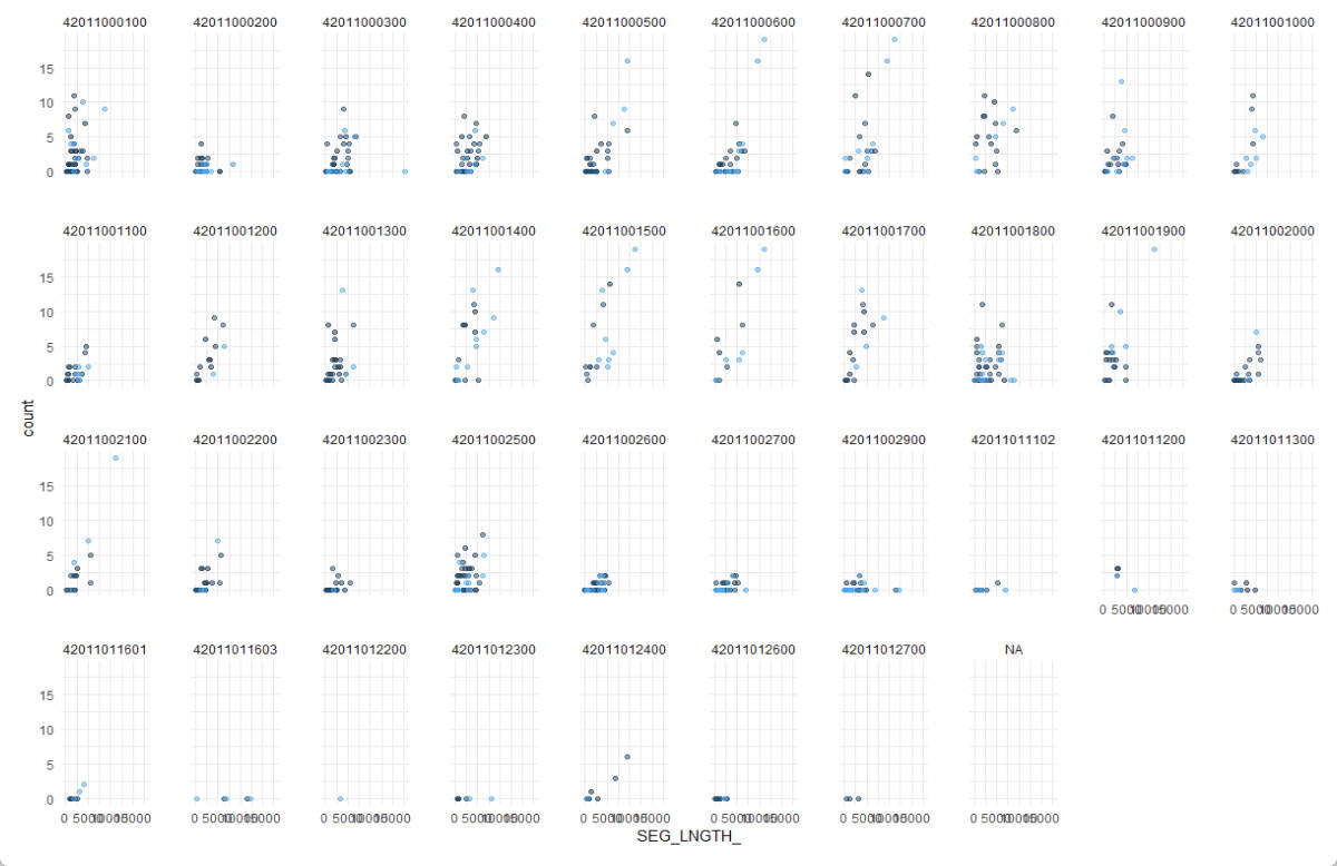
Data Explorer by Census Tract ID
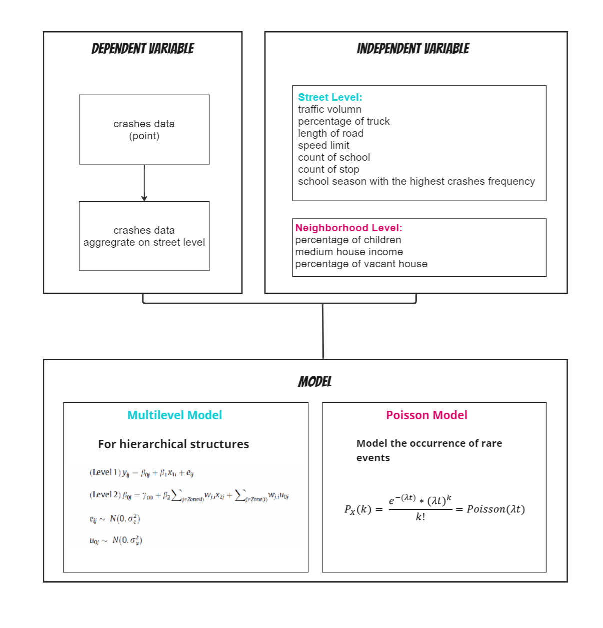
Methods
Deployed a multilevel model account for hierarchical structure of individual crashes history and neighborhoods by modeling the variation in car crashes at each level, estimating the effects of predictors, and predicting the potential possibility on each road segment.
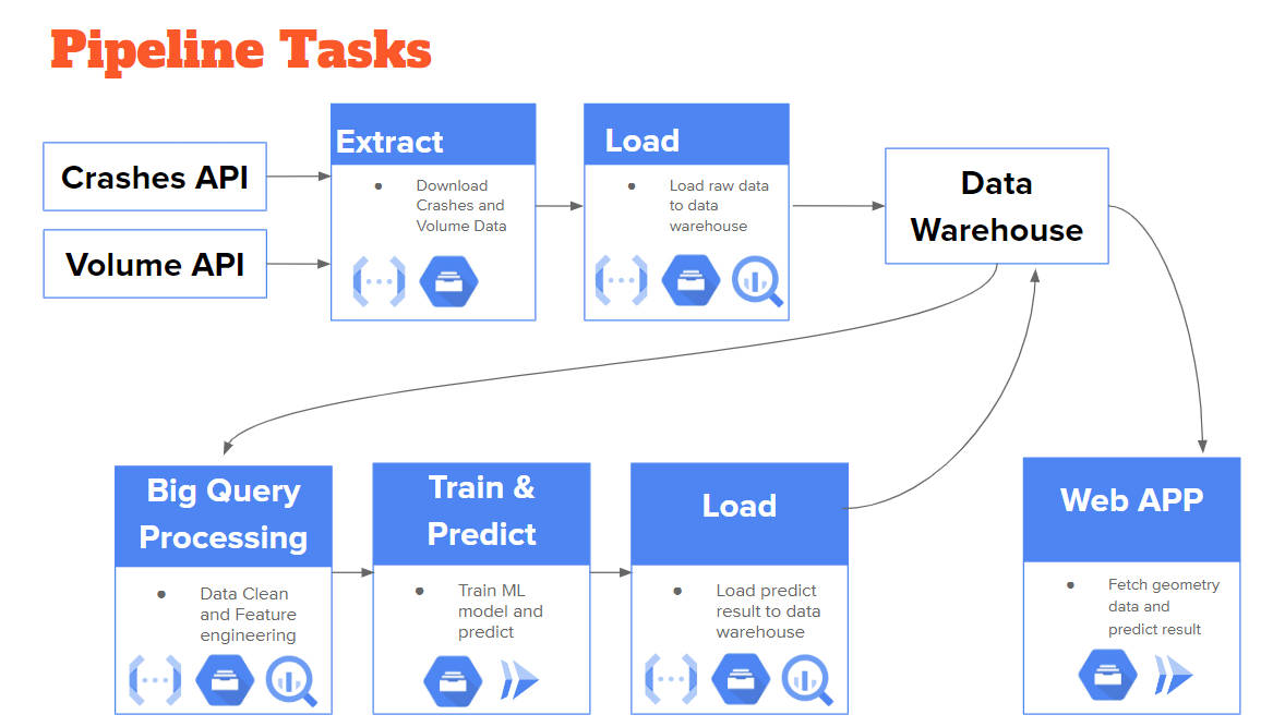
Data Pipeline
Leveraged Google Cloud Platform to ingest and process streaming data from PennDOT( Pennsylvania Department of Transportation ). By automating the data collection and analysis process, a data pipeline can provide real-time or near real-time insights into traffic patterns and risk factors. This can help transportation agencies and emergency services respond more quickly to accidents or other incidents.
Results
-
Community economic status is strongly associated with child car accident rates. While the p-value of community-level variables in the linear model may not always meet traditional thresholds of statistical significance, the variance in
the multilevel model suggests that a significant portion of the variation in car crash rates can be attributed to communitylevel
factors.
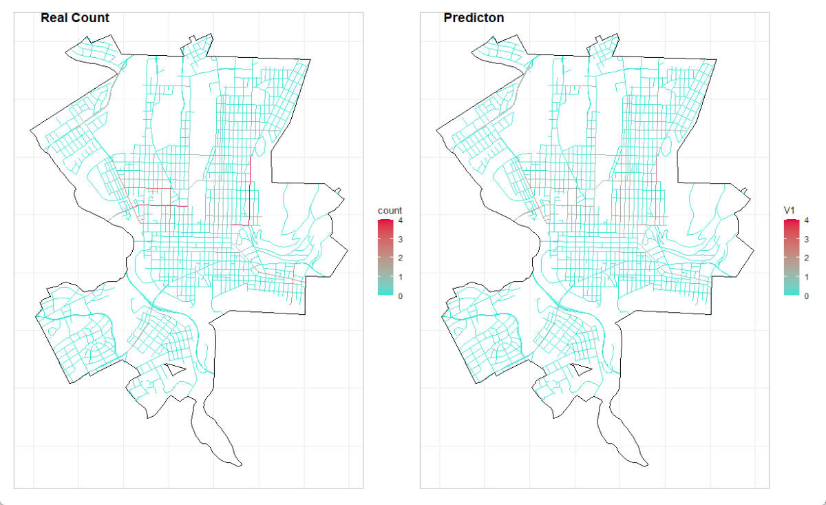
- This research uses MAPE (Mean Absolute Percentage Error) to evaluate the prediction accuracy of multilevel poisson model, which is 0.52. While this indicates that this model is not perfectly accurate, it is still able to effectively identify high-risk areas for car crashes. By comparing the mapping of real car crash history and prediction, we found that the pattern of risk areas identified by multilevel poisson model remained consistent despite the slightly lower predictionaccuracy. This suggests that this model is still able to effectively capture the underlying factors that contribute to car crashes and identify areas where preventative measures should be focused.
Implication
- Constructed a model for smallsample,
low-probability random
events.
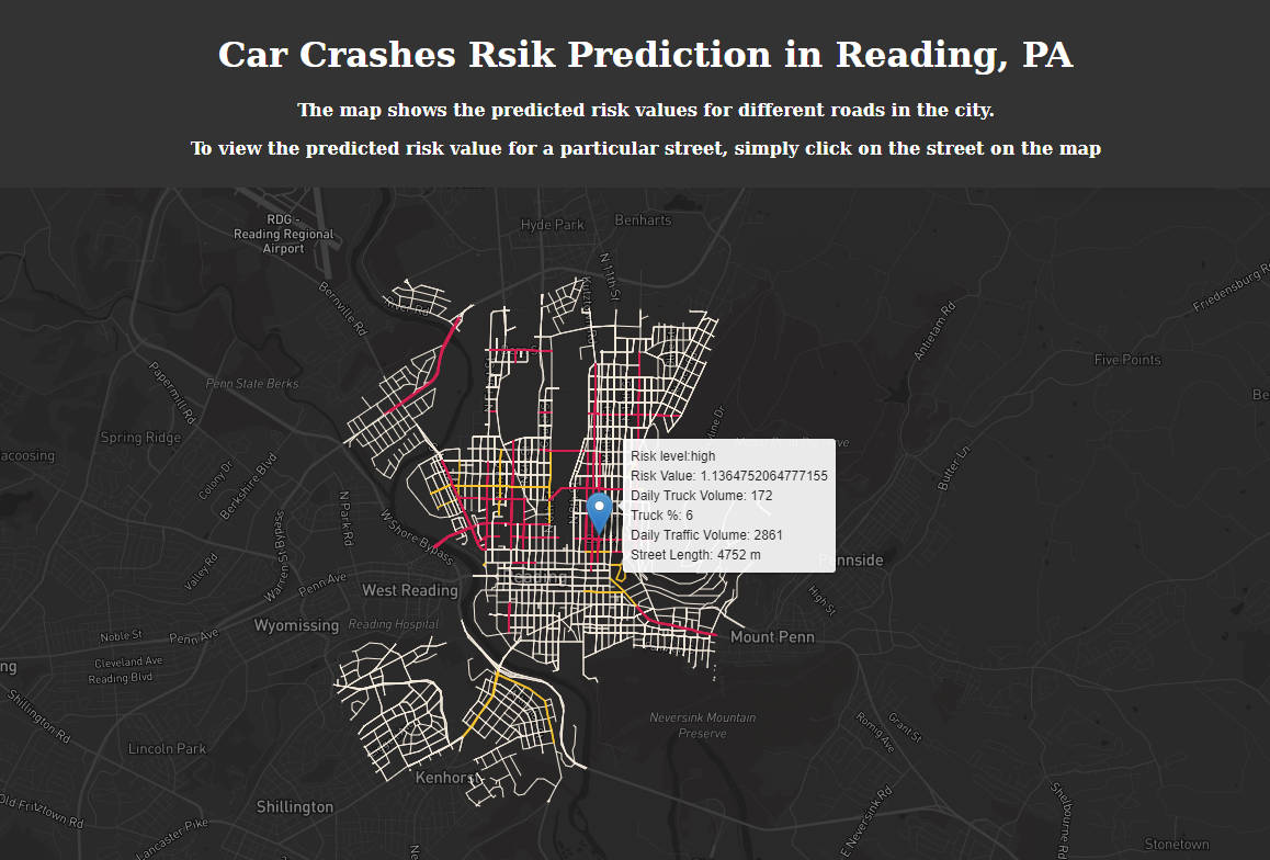
- Informed the development of specific interventions such as increasing the number of stop signs, widening walkways, and designing warning facilities tailored for child pedestrians.
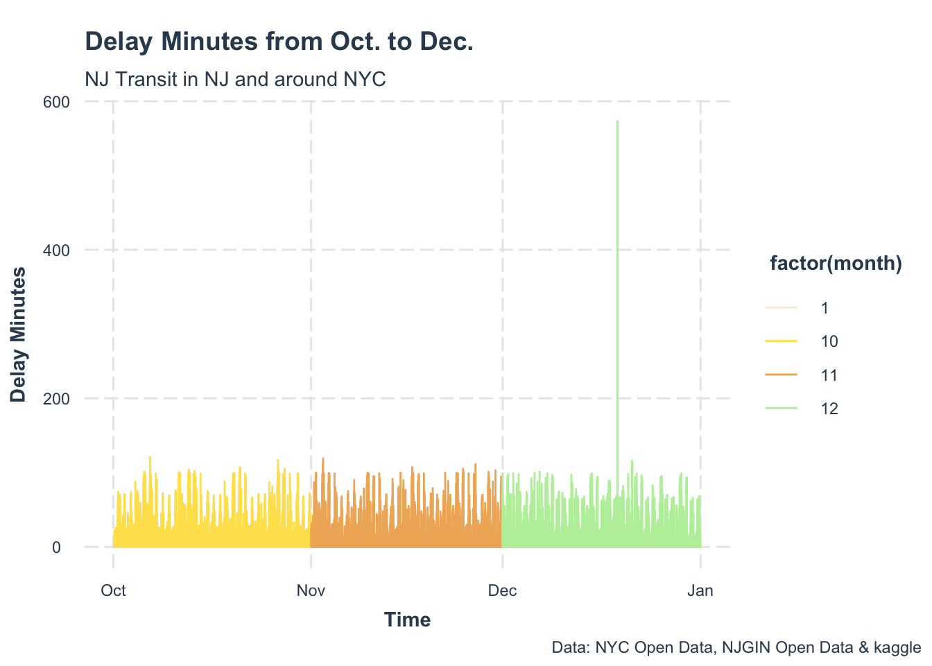
2. Forecast Metro Train Delays in NJ

NJ Transit system is a non-cyclical rail network that owns 11 lines and services 162 train stations in New Jersey and connects travelers to New York Penn Station. The region of NJ Transit operations has complex system dynamics that affect thousands of people everyday. Train delays will affect many people’s travel and schedules. Therefore, a good prediction could allow enough time for passengers to consider train delays and anticipate in advance.
Delay is the extra time it takes a train to operate on a route due to many factors, such as weather, stations, lines, and equipment. The delay will not only affect the operation of the train but also spread in the section, causing other trains to be late. Train delays will also cause a long time of passenger retention and bring inconvenience. We want to study trends and offer a better understanding of the principal factors that contribute to training delays. Therefore, our goal is to provide a reliable prediction of station delay that can help dispatchers to estimate the train operation status and make reasonable dispatching decisions to improve the operation and service quality of rail transit.
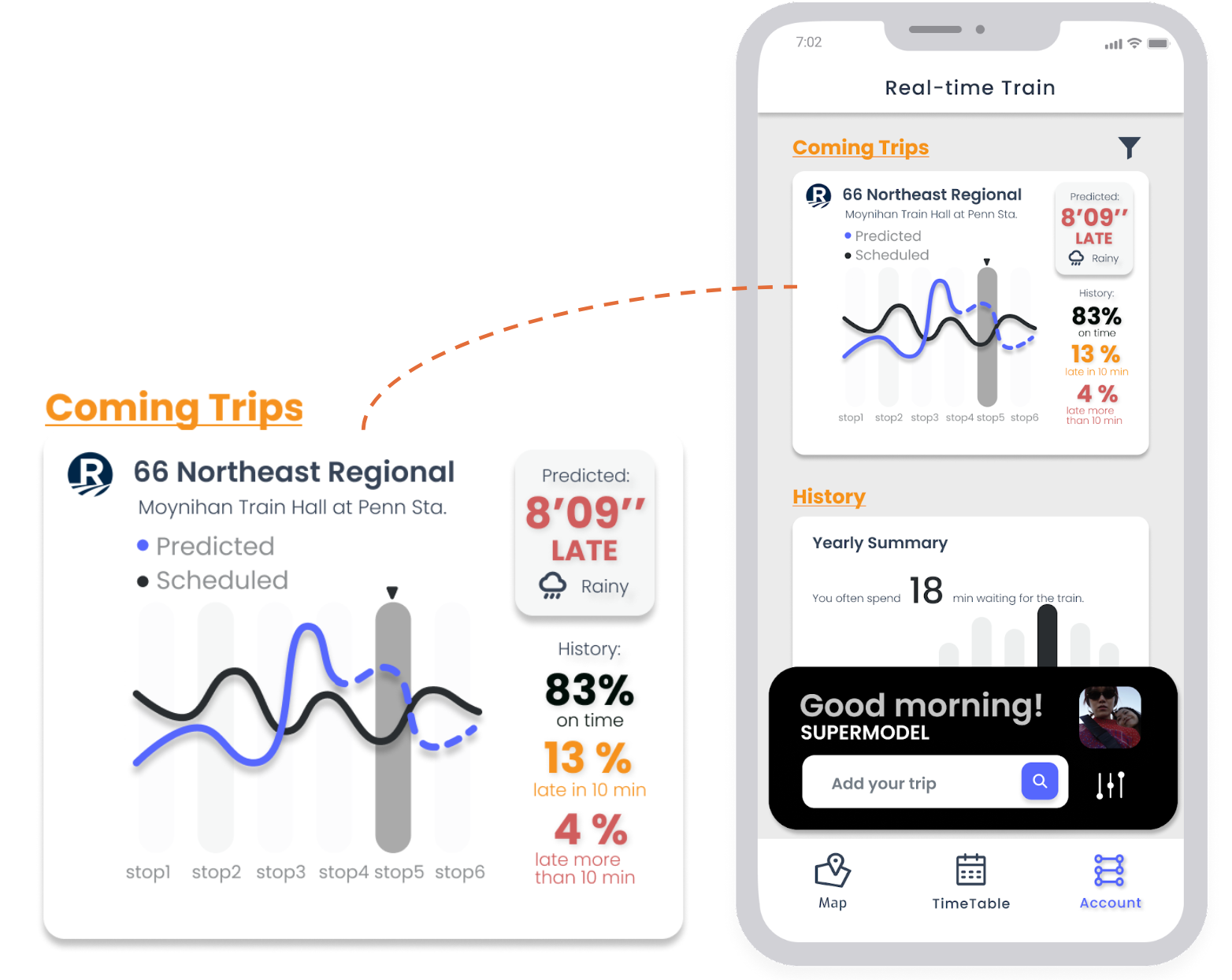
UI Design
According to this use case, we will focus on Rail Passengers. We design three main functions for them, which is to get real-time train information, offer train delay prediction. And users can click the customize button to get the train report by adding the train they interested.


Data Exploratory


Model
I created 7 regression models to identify the effects of spatial factors, temporal factors and also external features.
- Model A focuses on just time effects, including temporal controls: hour fixed effects, day of the week.
- Model B focuses on just space effects with the stations fixed effects, and also includes day of the week and the weather.
- Model C includes both time and space fixed effects, and also contains weather.
- Model D focuses on station lags, with both time and space fixed effects, weather and transportation features.
- Model E focuses on time lags, with both time and space fixed effects, weather, and transportation features.
- Model F focuses on both time lags and station lags, also includes time and space fixed effects, then contains weather and transportation features.
- Model G includes both time and space fixed effects, and also both time lags and station lags, then contains weather, transportation features and census factors.
Mathematically, we use some common evaluation metrics to examine the performance of models.
- Mean Absolute Error (MAE): the mean absolute error between observed and predicted values.
- R-squared (R2): the higher the R-squared, the better the model.
- Residual Standard Error (RSE): the lower the RSE, the better the model.
- AIC: the lower the AIC, the better the model.
From the summary table, the Model E, F, G have lower AIC value, and R-squared are much higher, compared with Model A, B, C, D. We conclude that adding station lags significantly improves the performance of model.
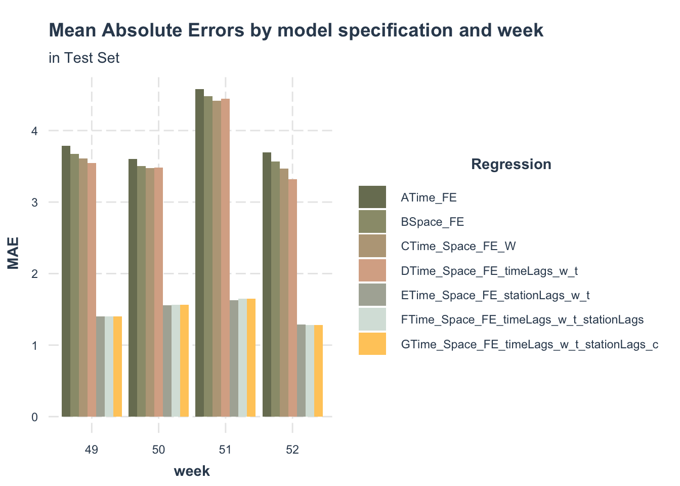

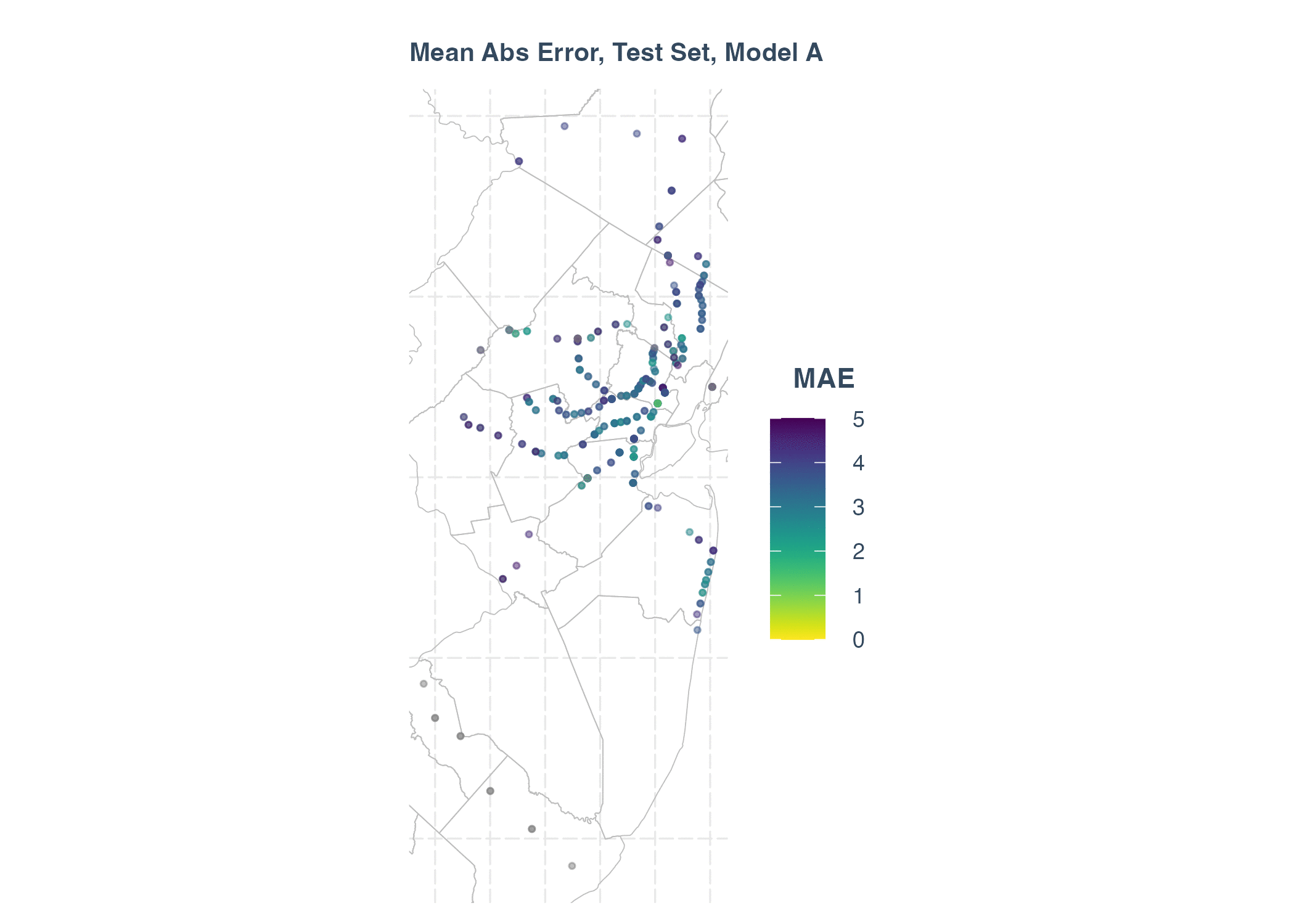
Main Abs Error in Test Set
3. Assult Risk Prediction in Chicago, IL

A new survey shows that nearly half of Chicago residents feel “very unsafe” in the city as a whole, and less than a quarter of Chicagoans feel safe in the city where they live. In addition, less than 30 percent of residents feel safe in their neighborhoods, while the same survey 2021 fall showed that 45 percent of the public felt safe in their neighborhoods.
A geospatial risk model is a regression model. The dependent variable is the occurrence of discrete events like crime, fires, etc. Predictions from these models are interpreted as ‘the forecasted risk/opportunity of that event occurring here’.
So I want to find out the regular of assault number that happens on the road. If we use a geo-spatial risk model, would it be possible for the police station to place more policers in places where road assault is likely to occur. Can such a model reduce the occurrence of road assault?
In order to avoid other assault information, like assault happens in the apartment or buildings. The dataset only contains assault happens on the street, sidewalk, and alleys.
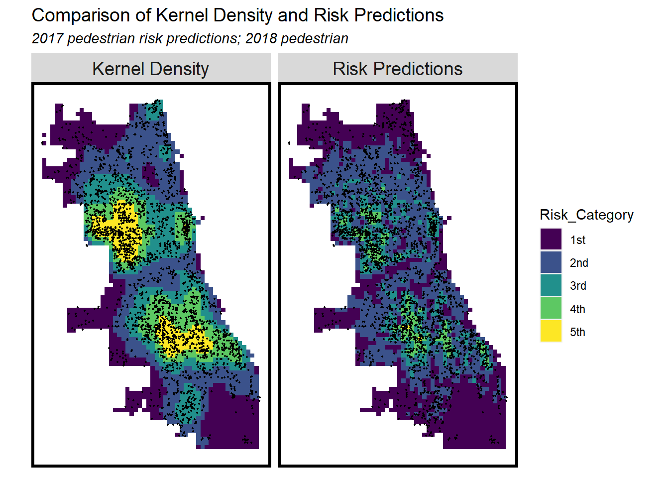
Data Visualization


Model Evaluation

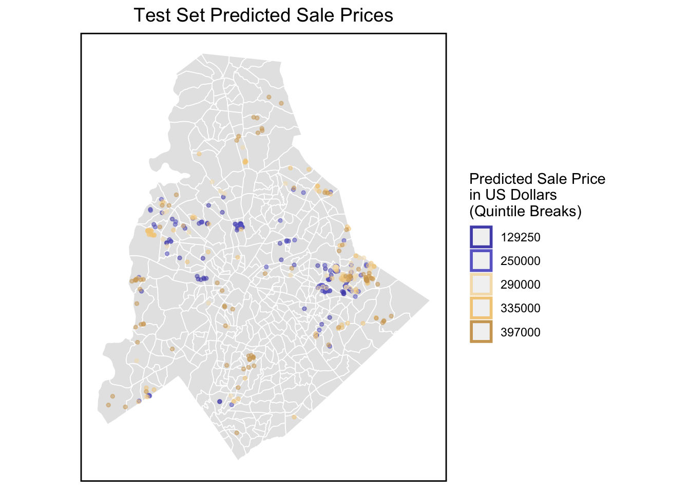
4. House Price Prediction in Mecklenburg County, NC
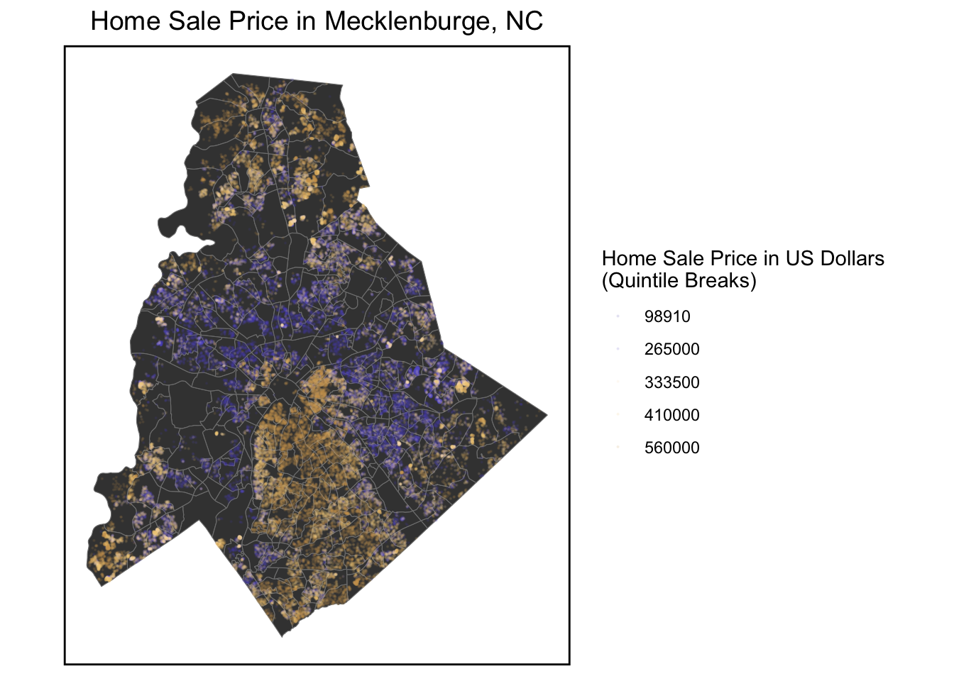
In Mecklenburg County, the housing market shows good trend recent years. Housing Price Prediction is necessary and helpful. The hedonic model is a theoretical framework for predicting home prices by deconstructing house price into the value of its constituent parts.
We first make OLS predictions according to the original dataset, and then filter the predictions according to the performance of the r square and MAPE to continuously optimize our model.
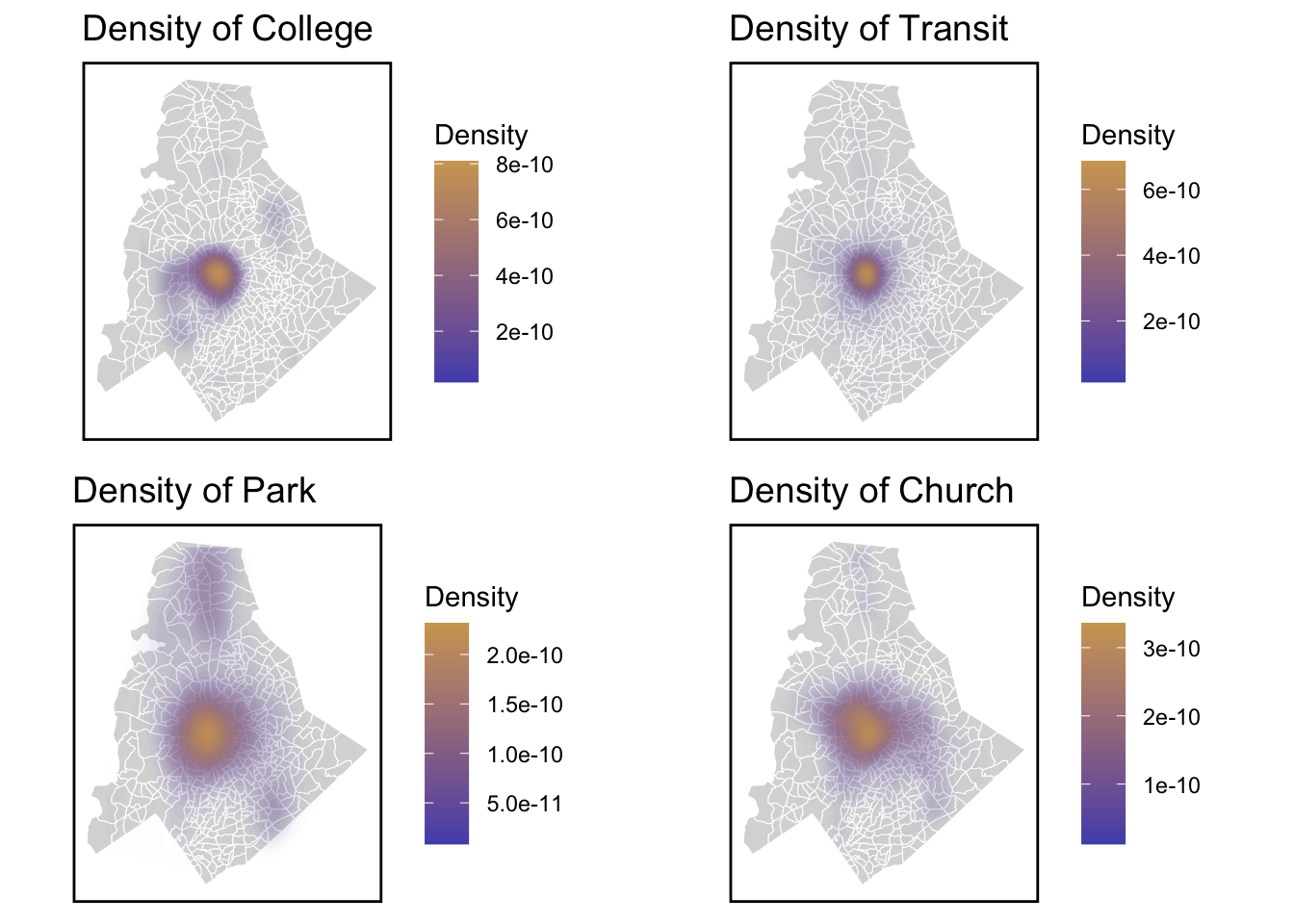
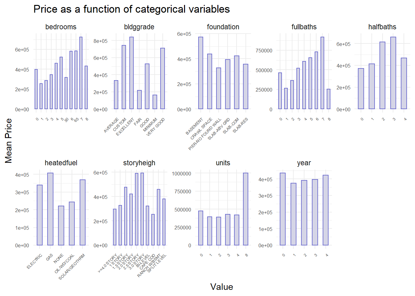
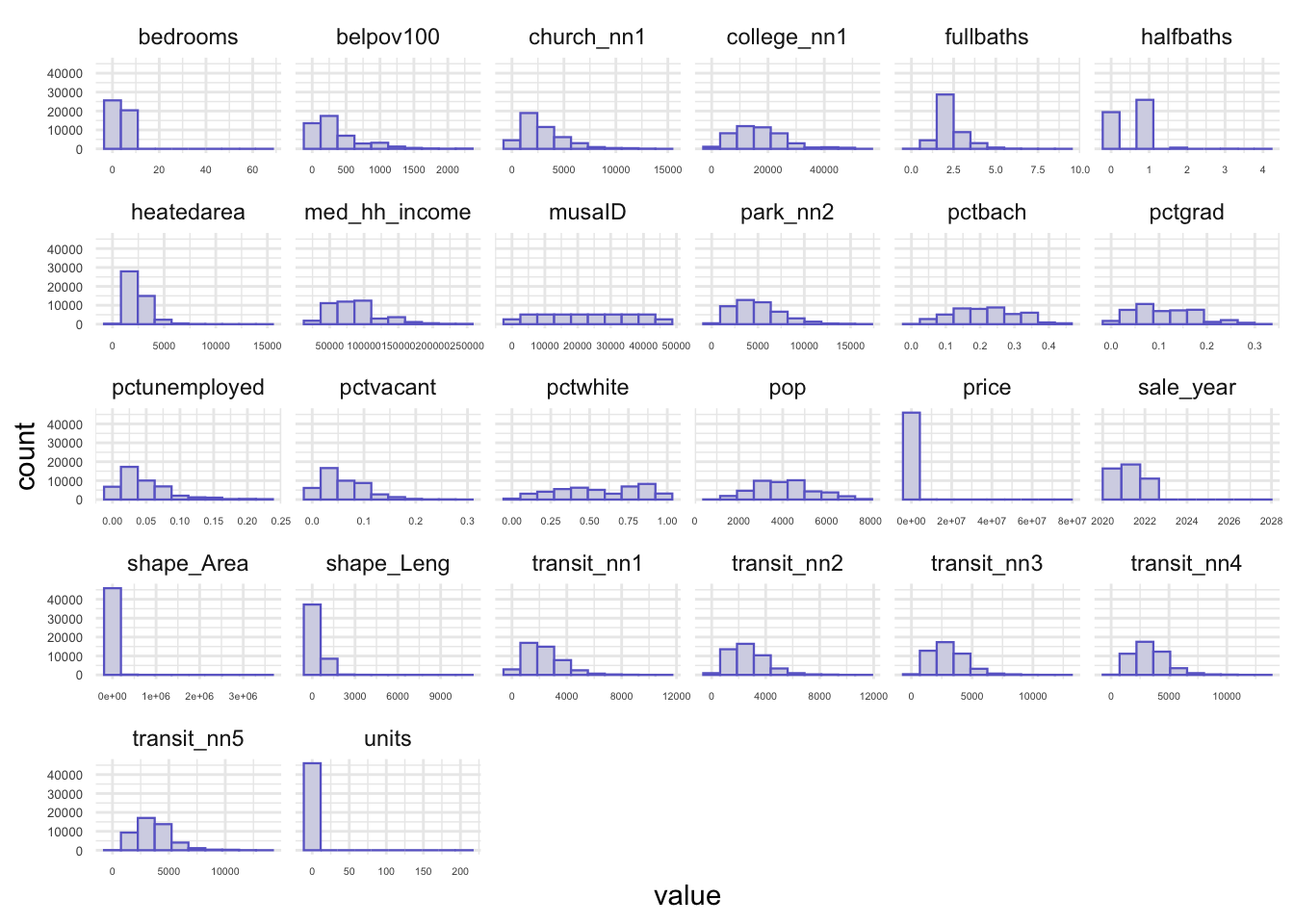
Data Exploratory
In the model, the dependent variable is house sale price. The factors are contains 3 types:
1.Interal characteristics
2.Amenities of decision factor
3.Spatial structure
In the histograms of numeric variables, it can be concluded the distribution of the number of the variables. These sample data are relatively concentrated.
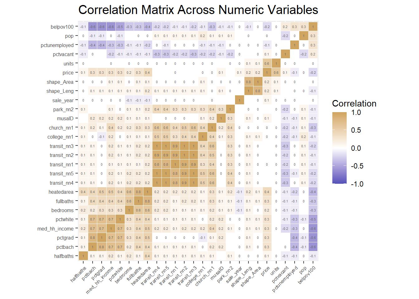
Correlation Matrix
A correlation matrix gives us the pairwise correlation of each set of features in our data. We add the each predictors’R square of correlation matrix in the plot. Our analysis of pairwise correlations between these predictors helps us assess the degree of association between these predictors.
At this time, we are going to delete collinear independent(R srquare>0.75 or <-0.75).
We choose the length of shape, distance to nearest 3 transit stops, percent of graduate, and move the shape area, percent bachelor degree and distance to nearest others transit stops out at the same time.
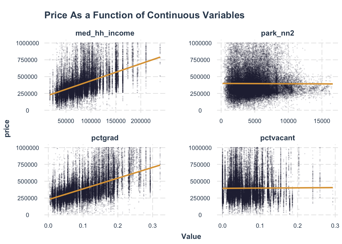
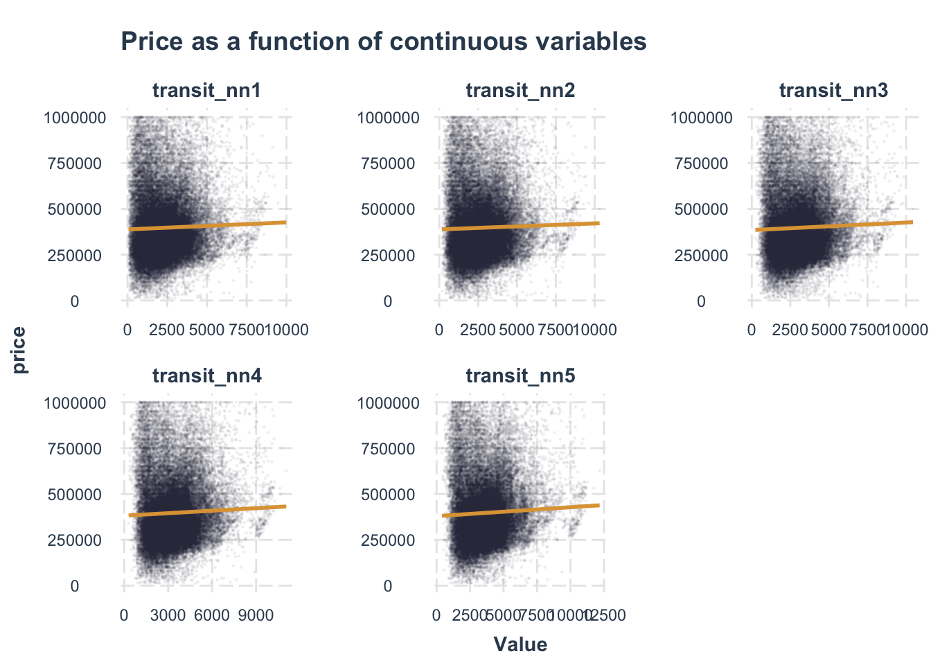
Analyzing Associations
We chose four factors that we thought were most relevant to house price, but it appears that school has little effect on home prices. But I wonder what will change in the multi-factor model afterwards.
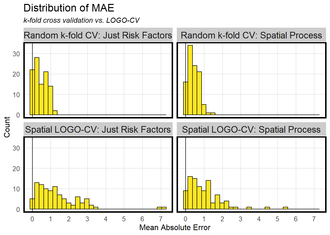
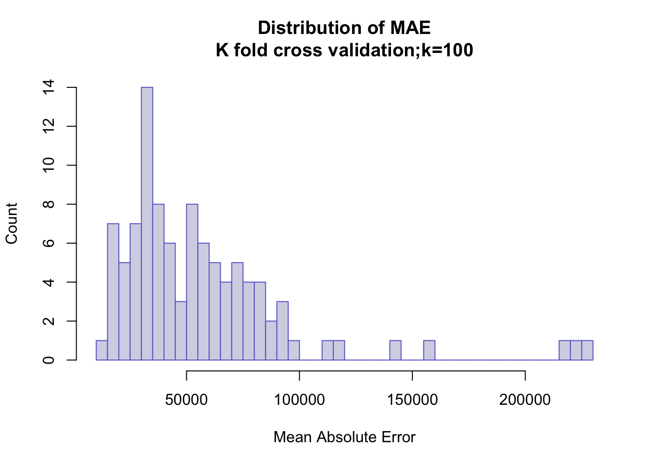
Model Comparison (OLS & Spatial Lag Models)
The distribution of MAE in OLS model is not aggregated enough, which there are still many scattered distributions. We consider that the reasons for this distribution may be:
1. The presence of some extreme values
2. The presence of spatial correlation.
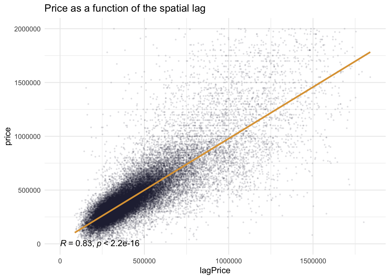
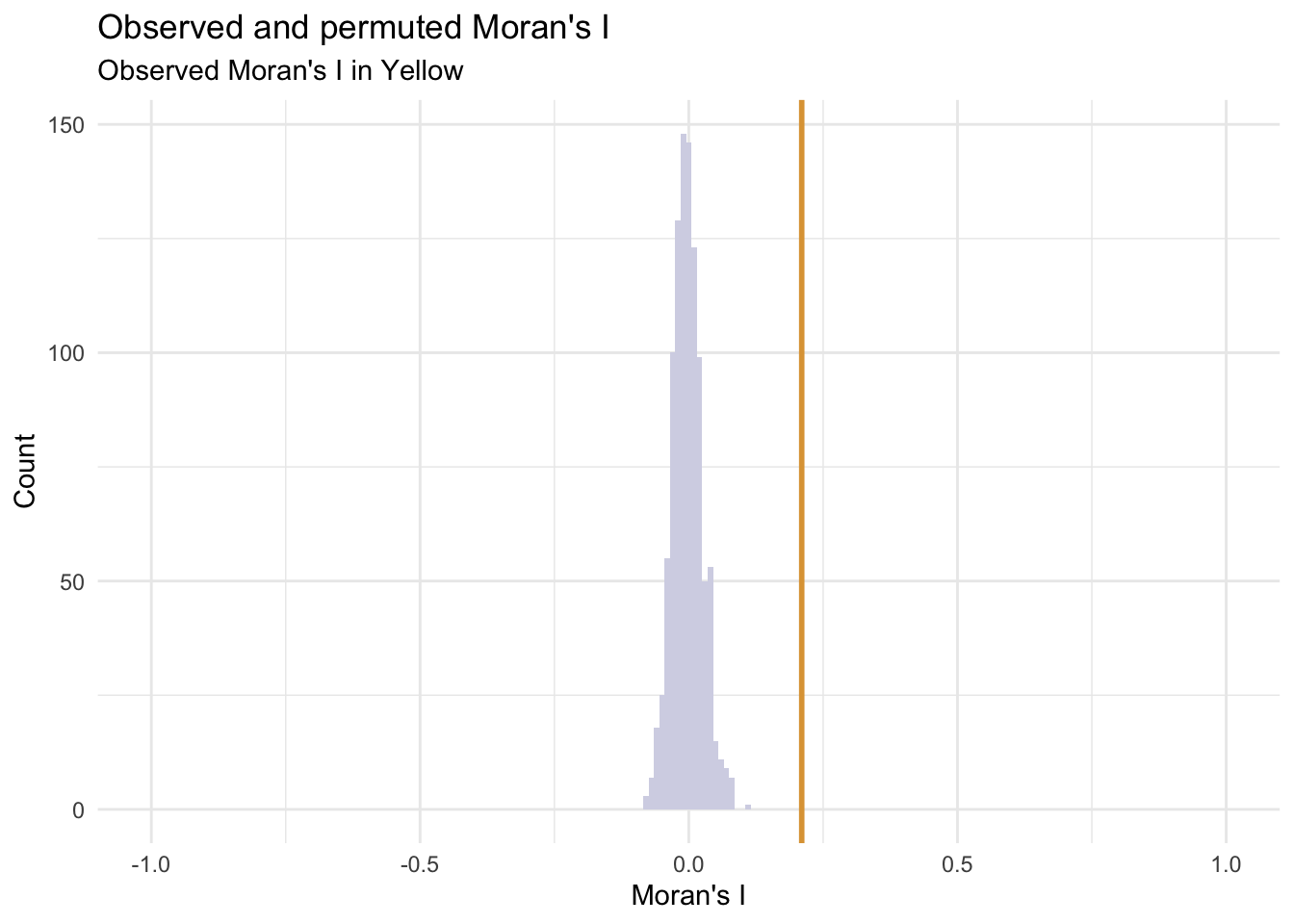
Moran’s I Test
The Moran’s I test results confirm our interpretation of the map. The Clustered point process yields a middling I of 0.31(Moran’s I value). But a p-value of 0.001 suggests that the observed point process is more clustered than all 999 random permutations (1 / 999 = 0.001) and is statistically significant.
Generalizability
The AbsError and APE all decrease, which means the Neighborhood Effects model is more accurate on both a dollars and percentage basis.
Predicted prices are plotted as a function of observed prices. Recall the purple line represents a would-be perfect fit, while the yellow line represents the predicted fit.
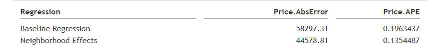
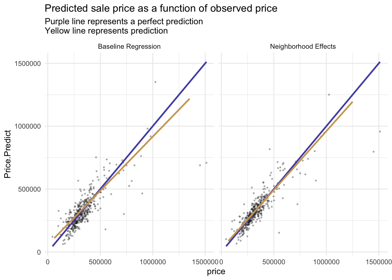
We would recommend this model. first we calculated our APE in the test set to be around 0.16, which is an acceptable margin of error.
When we compare the baseline model with the neighborhood model, we find that the regression curve becomes very well fitted after adding the spatial factor. the value of r-squared also remains stable at around 0.83.
And in terms of generalizability, our model has relatively strong generalizability across different kinds of partitions. However, it is worth mentioning that our model seems to fit better for high-income communities. The reason may be due to the larger amount of data in high-income communities or the richer facilities in high-income communities.
There are still some limitations in our model. If we need to create a super model that is broadly applicable to many types of communities, firstly, we are going to find the best predictive features or variables. Secondly, we have to try to inject enough predictive power into the model to make good predictions without over-fitting.
5. Targeting A House Subsidy
To decrease the severe situation in housing and economic problem, HCD wants to improve householders’ conditions by offering a home repair tax credit. Data analytics is helpful in this process. As we all know, the low conversion rate of promotion, offer, and allocation credits will lead to low effectiveness of HCD. The department will pay more because they can not reach out the eligible homeowners. I think data science can be helpful in this condition, especially the logic model, which can categorize people’s willingness to take credit.
Data Exploratory


Logistic Model Evaluation
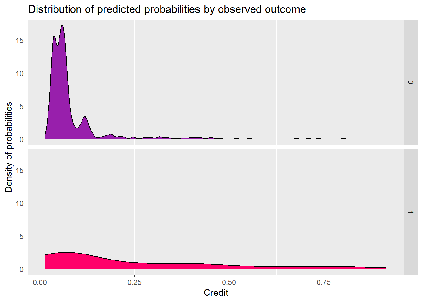
Compared two models, previous one’s (before feature engineering) distributions are more concentrated on the average values. So the model before feature engineering performs better in the Cross Validation.
The model performs well in people who don’t get the credit. But the people who will get the credit curve is flatten and has a small peak in the low threshold.

ROC Curve

Cost Benefit Analysis
This has all been building to an examination of the model in the context of our ad campaign. Let’s set this up to estimate the revenues associated with using this model under the following scenario:
-An impression (serving an ad) costs $0.10
-A click brings an estimated $0.35 of revenue per visitor on average.
a. Cost/Benefit Equation for Confusion Metric
True Positive - Predicted correctly homeowner would enter credit program; allocated the marketing resources, and 25% ultimately achieved the credit. True Negative - Predicted correctly homeowner would not take the credit, no marketing resources were allocated, and no credit was allocated. False Positive - Predicted incorrectly homeowner would take the credit; allocated marketing resources; no credit allocated. False Negative - We predicted that a homeowner would not take the credit but they did. These are likely homeowners who signed up for reasons unrelated to the marketing campaign. Thus, we ‘0 out’ this category, assuming the cost/benefit of this is $0.

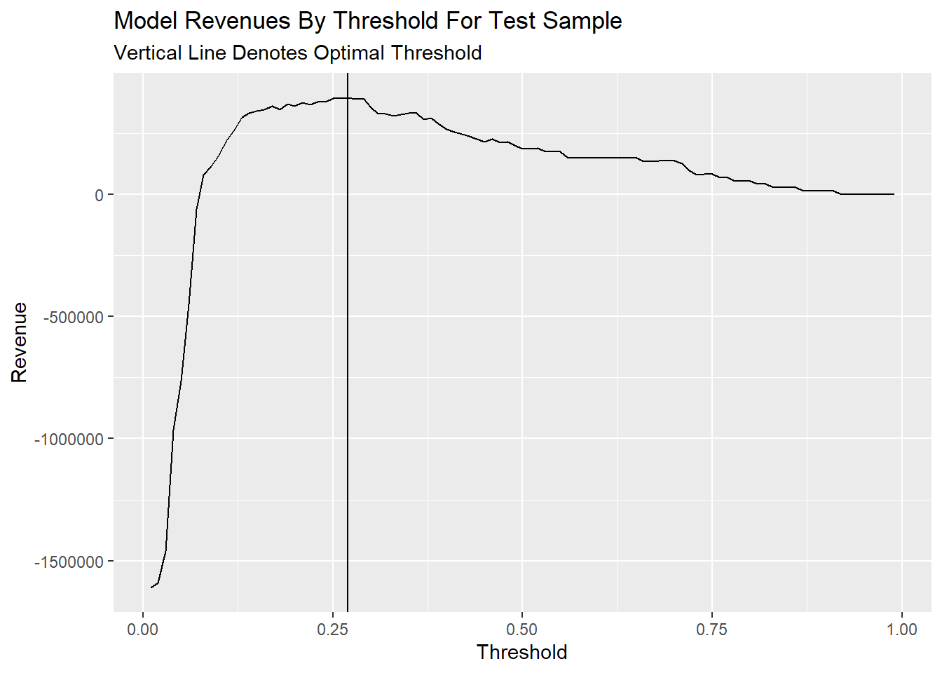
b. Plot Confusion Metric Outcomes of Each Threshold
Threshold as a function of Total_Revenue elaborates that total avenue all converge on 0 when the threshold gets bigger. According to my calculate function of revenue, True_Negative and False_Negative make 0 effects on revenue, so they are stable whether how the threshold change. As for True_Positive, when the threshold gets bigger to 1, the count of True_Positive will decrease close to 0, so the revenue will close to 0. The same as False_Positive.
This plot can be concluded the total count of negative samples is much bigger than positive samples, which may affect the accuracy difference between negative and positive samples. And both negative and positive results will change a lot in the range of 0.05-0.2 threshold.